Let’s be honest — marketing has a bit of a blind spot. For years, brands have optimized for the “average” user. But guess what? The average user doesn’t exist. Not really. And one group that’s been consistently overlooked? Neurodivergent folks. Think ADHD, autism, dyslexia, Tourette’s, and beyond. It’s a huge audience — around 15–20% of the global population — and they’re scrolling, shopping, and clicking just like everyone else. So why aren’t we designing for them?
Well, here’s the deal: inclusive marketing isn’t just about adding a wheelchair ramp or a diverse stock photo. It’s about rethinking how your message lands. It’s about removing friction. And honestly? It makes your content better for everyone. Let’s dive in.
What neurodivergence actually means (and why it matters)
Neurodivergence is a term for brains that work differently than the “neurotypical” standard. It’s not a disorder — it’s a variation. Like left-handedness, but for cognition. Some people process information faster visually. Others struggle with too much text. Many have sensory sensitivities — bright colors, loud autoplay videos, or flashing animations can be downright painful.
And here’s the kicker: neurodivergent people are often hyper-loyal to brands that “get” them. They notice the small things. A cluttered website? They bounce. A confusing checkout flow? Abandoned cart. But a clean, predictable experience? That builds trust. That builds a community.
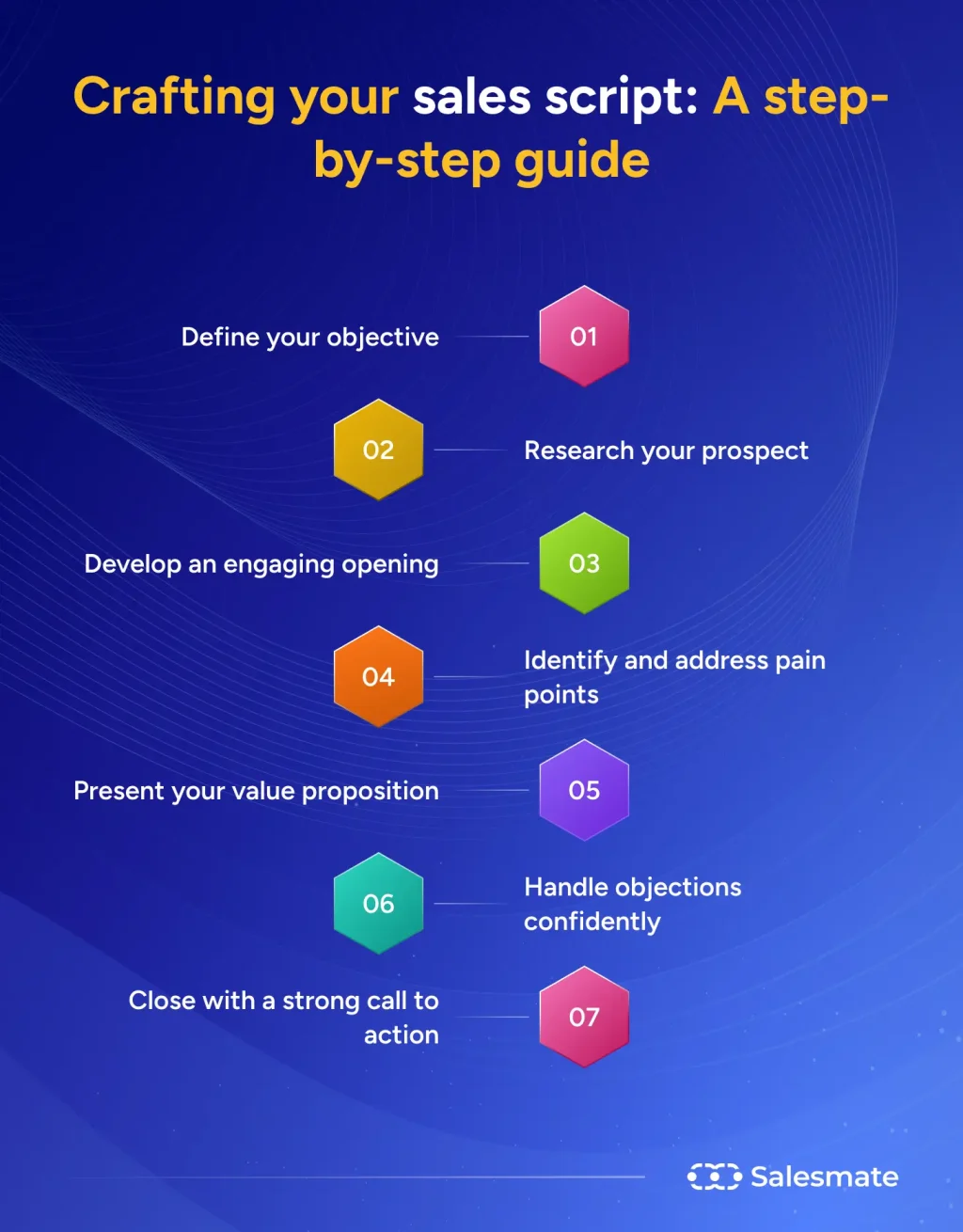
So, how do you actually do this? Let’s break it down — no fluff.
Start with sensory-friendly design
Think of your website as a room. Is it calm? Or is it a carnival? For someone with autism or sensory processing differences, too much visual noise — flashing banners, auto-playing music, rapid animations — can be overwhelming. It’s like trying to read a book in a mosh pit.
Here’s what works:
- Use a simple, high-contrast color palette. Avoid neon on neon.
- Give users control over motion. No auto-play video. No parallax scrolling that can’t be stopped.
- Provide a “reduce motion” toggle — it’s not just for accessibility, it’s a courtesy.
- Keep backgrounds clean. Busy patterns? Skip ‘em.
One brand doing this well? Slack. Their interface is minimal, customizable, and lets you turn off animations. It’s a small thing — but for an ADHD brain trying to focus, it’s a lifesaver.
Write like you’re texting a friend (but clearer)
Marketing copy is often stuffed with jargon, fluff, and long sentences. That’s a problem for dyslexic readers — and honestly, for most people. Short sentences win. Active voice wins. Bullet points? They’re your friend.
Try this approach:
- Use plain language. Say “start free trial” instead of “initiate your complimentary subscription”.
- Break up text with subheadings. Scannability is king.
- Bold key phrases — but don’t overdo it. Just the important stuff.
- Avoid metaphors that rely on visual or auditory cues. “See what I mean?” doesn’t work for everyone.
And here’s a quirk: some neurodivergent readers take things literally. So if you say “our software is a game-changer,” they might think… it’s a game? Just be direct. It’s more trustworthy, anyway.
A quick note on tone
Don’t try to sound “quirky” for the sake of it. Authenticity matters more than gimmicks. If you’re a B2B brand, be professional but warm. If you’re a lifestyle brand, be casual but clear. The goal is to reduce cognitive load — not add to it.
Make navigation predictable (boring is good)
You know what neurodivergent users love? Predictability. Routine. A menu that doesn’t surprise them. For someone with ADHD or autism, a website that changes its layout every visit is a nightmare. It’s like walking into a grocery store where the aisles move.
Here’s the checklist:
- Keep navigation consistent across pages. Same order, same labels.
- Use clear, descriptive button text. “Learn more” is vague. “See pricing” is better.
- Add breadcrumbs. They help users track where they are — especially if they get distracted.
- Include a search bar. It’s a lifeline for people who struggle with menus.
And don’t hide your contact info. Seriously. Some users need to ask a question before they buy. Make it easy.
Video and audio content? Offer options
Not everyone processes auditory information well. Some people with autism or ADHD can’t follow a podcast without visuals. Others need captions to focus. So here’s a rule: always provide alternatives.
Practical tips:
- Add accurate captions to every video. Not auto-generated — those are often gibberish.
- Provide transcripts for podcasts and webinars. It helps dyslexic readers and non-native speakers.
- Offer a “text-only” version of key content. Some users prefer reading over watching.
- Let users control playback speed. Slower for processing, faster for skimming.
I’ll be real — this takes extra effort. But it also opens up your content to a wider audience. And search engines love transcripts. So it’s a win-win.
Personalization without creepiness
Neurodivergent users often value control over their experience. They don’t want to be tracked in a way that feels invasive. But they do appreciate personalization that respects their preferences — like remembering they prefer dark mode or that they always skip video intros.
How to do it right:
- Let users set their own preferences (font size, contrast, animation on/off).
- Use cookies sparingly — and explain why you’re using them.
- Don’t assume gender or ability. Use “they” or ask directly.
There’s a fine line between helpful and creepy. Stay on the helpful side. Always.
Real-world examples that nail it
Let’s look at a few brands doing inclusive marketing right — not perfectly, but intentionally.
| Brand | What they do | Why it works |
|---|---|---|
| Microsoft | Offers immersive reader mode, dictation, and focus assist in Office | Reduces visual clutter; helps ADHD and dyslexic users |
| Target | Quiet shopping hours in stores; clear signage | Low-sensory environment for autistic shoppers |
| Headspace | Simple interface, no autoplay, calm colors | Reduces anxiety; predictable navigation |
| Apple | Built-in screen reader (VoiceOver), customizable display | Empowers users with dyslexia, low vision, and ADHD |
Notice a pattern? They all prioritize choice and clarity. They don’t dictate how you interact — they let you adapt the experience.
Common mistakes to avoid (learn from my blunders)
I’ve made plenty of mistakes myself. Here are a few I’ve seen — and some I’ve committed:
- Overloading with sensory stimuli. Confetti animations on a “thank you” page? Cute for some, migraine-inducing for others.
- Using “neurodivergent” as a buzzword. Don’t tokenize. Actually implement changes.
- Ignoring mobile users. Many neurodivergent people prefer mobile for its simplicity. Make sure your site works one-handed.
- Assuming all neurodivergent people are the same. Autism and ADHD are not interchangeable. Dyslexia and Tourette’s are different. Listen to actual communities.
One more thing: don’t ask neurodivergent people to “fix” your content for free. Hire them. Pay them. Their lived experience is expertise.
Measuring success beyond clicks
Inclusive marketing isn’t just about vanity metrics. Sure, you’ll likely see lower bounce rates and higher conversion. But the real win? Brand loyalty. Neurodivergent audiences talk. They share brands that respect them. They stick around.
Track these instead:
- Time on page (especially for content-heavy pages).
- Task completion rates (did they find what they needed?).
- Feedback from accessibility audits (use real users, not just tools).
- Repeat visits and referral traffic from neurodivergent communities.
And remember — you won’t get it perfect on day one. That’s fine. Inclusive marketing is a journey, not a checkbox.
Final thought (no pressure, just perspective)
Inclusive marketing for neurodivergent audiences isn’t about ticking boxes or being “woke.” It’s about respect. It’s about recognizing that different brains experience the world differently — and designing for that reality. When you reduce friction, you don’t just help one group. You create a smoother, more human experience for everyone.
So go ahead. Rethink that autoplay video. Simplify that navigation. Write like you mean it. The neurodivergent audience is waiting — and they’re more than ready to meet you where you are.